Dead or Alive: Paradise’s graphics are 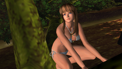 limited by the technical abilities of the PSP. The intro scene is the only positive in regards to visuals. The CGI intro of the game is surprisingly good, especially for a handheld. However, the in-game graphics, which are mainly built around showing off big breasts, are disappointing, and it is very clear that highlighting the breasts was the developer’s only focus.
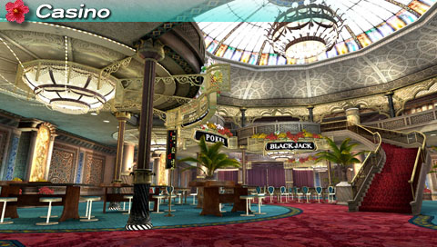
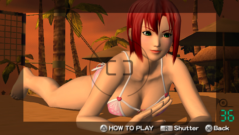 Dead or Alive: Paradise includes a photo capture feature. While creepily spying on the girls while they relax, players have the option of snapping photos with an in-game camera. The controls for the camera feature are simple at best and ultimately allow you to take a close-up image of her “assets”. You’re not rewarded in any form for your photography skills, but the game allows you to save the images on to the PSP’s memory card as an image. Dead or Alive: Paradise also features a few card and slot machine mini-games at the casino, but the bland presentation of the environment makes it look like the developers spent a single afternoon making the casino.
The amount of replayability in Dead or Alive: Paradise is lacking as well. There’s no tournament, league, or any competitive modes within the game. You simply receive money for winning volleyball games, and then spend it on accessories for your beach friends. You can spend several hours building friendships, using all the menus and checking the store for new items to gift, but ultimately it’s pointless to do so.
Dead or Alive: Paradise sets a powerful example of bad game design. The concept of the game is flimsy, and lacks any decent gameplay, sense of accomplishment, or suitable visuals. It’s also painfully shallow, and unlikely to satisfy even the most desperate of stalkers. Dead or Alive: Paradise is a poorly-made game that’s best left for dead.
PlayStation LifeStyle’s Final Score
Bland presentation Gameplay lacks in all aspects Frustratingly pointless features |
 |
