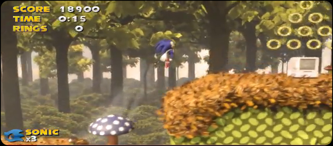
We recently reported on an amazing fan-made video of Sonic & Knuckles, redone with current-gen graphics and, essentially, toting the exact look and feel that Sonic fans have be longing for for years. We managed to get in contact with video creator and 3D artist, Robert Medina to get the lowdown on exactly what it took to put this mini masterpiece together and whether or not we can expect future video remakes based on the Sonic franchise.
Speaking with PlayStationLifeStyle, Robert responded with the following:
I really am surprised by the response from this video.Had I known it would get this much attention, I’d probably have put some more time into finishing the level, and polishing the animation and effects further. This was actually just a quick project I did for fun over a couple of weeks so I could see how well a classic style Sonic game would adapt to 2.5D/3D graphics. It wasn’t meant to draw any comparisons to Sonic 4, and wasn’t intended to make any major design changes to the game or introduce any new elements, hence the fact it sticks quite close to the original design of the level and Sonic. I know one of the main criticisms of my video is the Sonic model and animations, so I perhaps stuck too close to the original game in that regard.
Although the final video looks fairly good, it wasn’t really a complex or lengthy video to create. The level blocks are all pretty simple, and reused to create the larger level, and much of the animation consisted of small looping animations.
The reason it looks good (and why people have liked it) is because of how the 2D elements of Sonic were adapted to 3D, and because of the modern lighting and effects used to update the original look. And while it’s true that these effects weren’t achieved in realtime, with today’s modern consoles a similar game could easily get 95% of the way there with pre-rendered lighting and pixel shaders. The polygon counts are not very high due to the flatter depth of 2D gameplay, so that’s not a problem either.
I haven’t been contacted by Sega or anyone else concerning the video. I really don’t expect to, since it only showcases graphics, and doesn’t show a lot of new ideas aside from that. The video was posted on Sega’s blog, so I know someone has seen it, but I don’t expect anything to come of that. There have been hundreds of comments comparing my video to Sonic 4, but I don’t know that it will count for much in the long run. But if they were interested, I have plenty of ideas.
If interest keeps up, I may create another video, maybe even create a video showcasing some completely new ideas rather than remaking old ones, but since this is only for fun, I’m not sure if I will at this stage.
-Robert Medina
It’s certainly awesome to have an overview of just what went down behind the scenes. All-in-all, if Sega were to adopt this design concept, it just might lead to the rejuvenation of the Sonic franchise. This is just one instance where a fan’s concept meets or exceeds fan’s expectations for a particular character or game. It goes to show that if a person puts in enough time and effort, they have the power to make others’ dreams a reality.
We would like to thank Robert Medina for providing the background details for this video, as it really is quite remarkable. Based on the ease of production, as described in the response above, hopefully Sega will have the common sense to either contact Robert, or adopt this style of animation altogether.
If you still have yet to see the video, we’ve gone ahead and embedded it below for your viewing pleasure. Note that this video clocked in at around 70,000 views when we first covered it, but is now boasting a much higher number, around 270,000 views.
For all the latest Sonic news, in addition to some remarkable fan projects, be sure to stay tuned to PlayStation LifeStyle!


