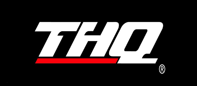
Publisher THQ is responsible for hit games such as the Smackdown vs. Raw series, the upcoming Homefront title, the Saint’s Row series, and the Red Faction series. Needless to say they have put out some high quality titles, both in this generation of gaming, as well as in the past. However, THQ cannot compare in size to many other publishers such as Activision and EA, something they are planning on changing with a revamp of their core principals – even including their logo.

They felt this change was definitely needed for their company, and here is what the President and CEO of THQ, Brian Farrell, had to say on the recent change:
By developing triple-A, innovative, original intellectual properties, attracting the top talent in the industry, and placing that talent first, THQ continues to redefine itself. This new logo seeks to capture that change and make it tangible.
You can see it in the deep, rich storylines, in the expansion of social and mobile gaming, and in the introduction of new technologies that enhance the gaming experience. THQ is proving its commitment to deliver the best experience to gamers through internally developed original intellectual properties (Homefront™ and uDraw™), creative partnerships, (Guillermo del Toro and Tomonobu Itagaki) and new talent acquisitions (Patrice Désilets), in order to solidify its position as a flagship publisher of extraordinary interactive entertainment. The logo will begin appearing on retail packages as soon as next month, and is already featured on the THQ website.
So what are your thoughts on the logo change? Overall, it seems like a much cleaner look for THQ, but it will be a shame to see the logo many have come to love become a thing of the past.
[Source]
