Eidos Montreal’s first console game is a mammoth of a title – Deus Ex: Human Revolution. With the game releasing next Tuesday, publisher Square Enix flew us to their Montreal offices to discuss the game and the long development process that ensued (the game was originally announced back in 2007). We were able to pick the brain of Art Director Jonathan Jacques-Belletête and see just what went into crafting the look and feel of a new chapter in the Deus Ex world, and how the idea of a cyber Renaissance came about.
We were speaking with Producer David Anfossi earlier, and he mentioned that there’s a lot of influence from the Renaissance in Deus Ex: Human Revolution. What brought about the decision to go this route?
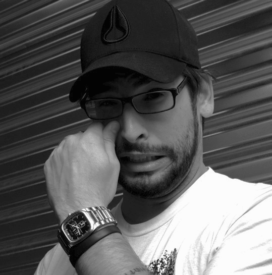
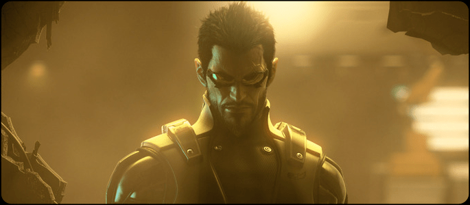
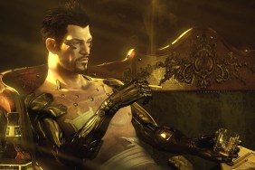
Well, you know, what’s always really important for me, in creating the visuals for a game is to give it a visual statement, like an aesthetic statement. Something to ensure that the game is going to stand out, that it has its own voice, its own vision – that it doesn’t get lost in all the blurriness of all the games that look the same. So that’s always my goal, even though I don’t always know if I’m going to do it or where I’m going to go with that. In Deus Ex, you have the stylized visuals, the way the textures are done and everything, that also gives it its own flavor. But I wanted something stronger as well. So I started my research in transhumanism and all that stuff, and then I stumbled upon Leonardo da Vinci’s anatomical sketches that he would do. I had seen them before, obviously, while doing my research in transhumanism, and it just kind of hit me how they almost look like prosthetics, you know – there was a strong link there somehow. Then I started studying all that. If you say that cyberpunk, or transhumanism, for example, is about upgrading the human machine, the Renaissance was all about understanding the human machine in the sense that, in order to upgrade a system, first you need to understand how the system works at its foundation. You’re not going to be able to upgrade it if you don’t understand how it works to begin with. The Renaissance is really in the West, where we started really studying properly the human machine, with dissections and all these things, [whereas] in the Dark Ages it was very taboo – it was illegal. So if in the Renaissance we started studying how the human machine works, and transhumanism is about upgrading it, I kind of metaphorically decided it’s just one continuous line. It’s almost as if the Renaissance era is the beginning of transhumanism. So [Game Director Jean Francois Dugas] liked the metaphor, [Lead Writer Mary DeMarle] liked it, then we also came out with the Icarus myth, which is not the Renaissance, but because the Renaissance is about re-finding all the discoveries/antiquities of the Greeks and all that stuff, which is where the Icarus myth is from, they’re kind of all tied in as well. But then my challenge was: okay, cool, the analogy seems to work. But now, how am I going to put it visually in the game? I wanted to make sure the clothing was reflective of a bit of the Renaissance, and some of the architecture and everything. That was quite hard. The color palette, black and gold, came in as well. To have the proper balance of having the fashion looking wearable, contemporary, cyberpunk, and Renaissance all at the same time was really hard! I think it ended up working. It’s definitely not everywhere in the game. It’s where it needs to be. Wherever it narratively supports a character or and environment or whatever, to actually thematize it with the cyber renaissance.
Was there anything you really wanted to put into the game but just ran out of time and couldn’t fit in?
Yeah, there’s always stuff like that. It’s part of developing a game. There’s always stuff that you either couldn’t put in or stuff that you were allowed to but ended up not having time, or stuff that you just literally cut out. We cut a whole city hub out of the game…It was a place where visually, I really liked it. It was one of my very important visual parts of the game. But for other reasons it had to be cut. So it was really hard to let go of that. You get emotionally attached to these things. But you need to be professional about it.
Well, cut sections aside, what would you say is your favorite area in the game?
That’s a great question actually! There’s a room somewhere in the game that’s just all-white. Everything’s white! Let’s say this microphone is in the room – it’d be painted white. The walls are white, the furniture is white, the computers are white. It’s very much one of our cyber Renaissance rooms, it’s very baroque. I quite, quite like it. Won’t say where it is, or who it belongs to [it’s a surprise!]. Apart from that, I think Lower Hengsha, which is one of our main city hubs in the game. I’m very satisfied with the density of the streets and all the shops that we designed – all the fruit stores and meat stores, it all has this Asian flair/flavor to it. The little tech stores with laptops and cell phones and everything in them, there’s so many details. Then you have the floor above your head in that city, which is basically the floor of the second floor of the city. I think it’s quite special to be in those streets that feel fairly contemporary; even though it’s very cluttered and narrow and everything, there’s nothing too sci-fi in the streets. Then you look above, and there’s this huge engineering feat right above your head! It almost looks like the bottom of the “star destroyer,” right above the city. I think this contrast works really well. I quite like it.
One thing we noticed is the presence of a lot of in-world brands. How much leeway were you given to develop these brands?
You know, as an art director in games, I think it’s all about details. It’s a little sad – a lot of companies and other places, they only care about the high-level. The high-level’s really important. If you don’t have your high-level direction, your details are not going to work. So they work hand-in-hand. But I make sure I get a strong high-level visual direction, and then I get into the crazy details. So we have over 1300 props in the game. Anywhere from a very contemporary looking microphone, like yours, to a very sci-fi machine – it’s all there. Then we also wanted to have brands for all these things, so we developed these special shaders where you can have a pretty good resolution of a logo and a brand on all these objects everywhere, because that’s what we live in. If you look in this room that we’re in [right now], there’s brands. Not only brands, but little labels everywhere! I’m sure even here, which looks pretty empty, we could count probably around a hundred. If you look at the headphones, your watch, my phone, and all these things…we don’t consciously notice them any more, but our brains are continuously registering these things at an unconscious level. So that’s why I wanted to have this in the game, because I’m sure that even if you don’t notice them, your brain still registers them. You kind of feel the world as a very credible place because of that. It’s very costly to do these things. To make so many props, so many brands. I’ve worked at companies before where they never would have let me do this. Never in a hundred years! On this project, I had great bosses, like our producer David [Anfossi], who just let me do my thing, and Stephane D’Astous, the General Manager as well, who just let me do my thing. They believed in me, they believed in my ideas. So we have a hundred brands in the game, anywhere from jewellery for women all the way to cybernetics companies. Shoe brands to computer brands, car brands, food, everything. Each one of those hundred brands have their own logos, typos, fonts – we had to design all these things. It’s quite crazy, but I’m glad you noticed it. Most people do, and I’m sure if they don’t notice it consciously, I’m sure the brain registers all these things, and I truly believe that at the end of the day it’s the details that make your world live.
What sort of lesson have you learned with the lengthy development process?
Too many! This whole game was a lesson…That’s a good question. I think, it’ll sound a little boring maybe, but it’s very much a game design lesson, because even as an Art Director I’m very much into how to design games and everything: I think we’ve learned how to make an RPG. I think that’s the main lesson. Montréal is a great video game developing city – it’s known for its talent. We mostly specialize in first-person shooters and adventure games; this is the first RPG done in Montréal, especially at that AAA level. So we knew what it entailed. We knew what it meant, but we had never actually done it before, so we had so much to learn. In terms of [a more traditional lesson]? Well, it’s very hard to bring back one of the biggest franchises in the industry! [Chuckles] Very hard. You have to deal with your own people, and you have to deal with the fans.
Speaking of the fans of Deus Ex, what do you hope they take away from the art direction that you took the franchise?
Hmm…I hope they will really feel that they are in a very homogeneous, credible, world. That it will make them feel something, literally make them feel emotions while they play. That it will help to their immersion. That it will make them think a bit. Mostly that it’s going to be singular, that it is the art of Deus Ex. It doesn’t look like any other game you have played before, it doesn’t get lost in all [the other games]. It doesn’t look the same. A lot of games look exactly the same, and hopefully this game doesn’t feel like that. It feels like itself.
Finally, how do you enjoy playing the game?
I’m a stealth killer! I kill, but I don’t go guns-blazing. I like to observe my terrain, see what’s going on, make sure that I find everything. But I always try to just eliminate everybody without being seen – a stealthy assassin!
We would like to extend our thanks to Square Enix, Eidos Montreal and Jonathan for taking the time out to speak with us. Stay tuned for more interviews from this event, and of course our review of Deus Ex: Human Revolution next week!
