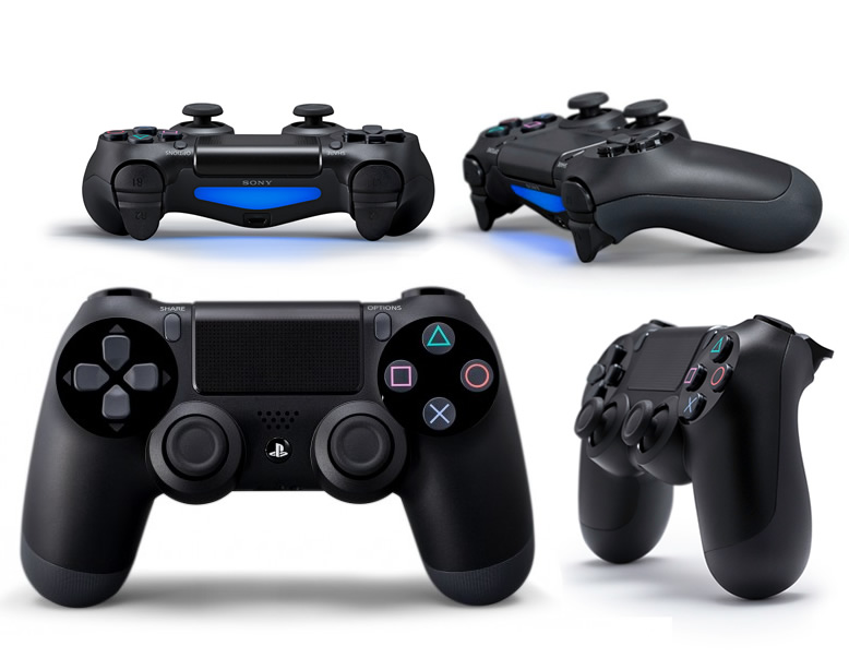
Before we get into our extensive preview coverage of all the PlayStation 4 games coming out of E3 this week, we wanted to focus on what you will use to play these amazing games: The DualShock 4 controller. Normally, the look, feel, and functionality of a controller isn’t all that important, but this is the first time Sony went with a new controller design since the original DualShock was released for the PSOne back in 1998—meaning PlayStation gamers have used the essentially same controller design in fifteen years.
The DualShock 4 may look very different, but it instantly feels familiar. So familiar, in fact, that I had to look closely at it while I had it in my hands to really catch what’s so different about the design. The handles of the controller are more cylindrical in shape, making for a better grip in the hand. The surface also has more of a matte finish that’ll prevent slippage during long, sweaty-handed gaming sessions. And the DualShock 4 is less angular, while being larger overall, adding to the comfort of holding it.
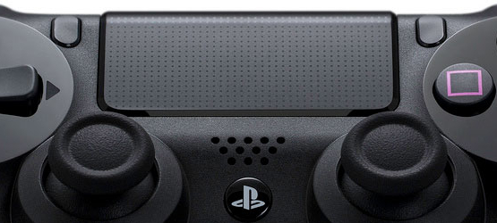
Functionally speaking, though, the new clickable touchpad is a major change. It’s located toward the top of the controller, but still on the face so it’s easy enough to reach. My thumbs didn’t do the best job reaching and swiping, but taking your finger off the rest of the controller for some quick swipes didn’t detract from gameplay or put my playthrough at risk of losing. And it felt rather natural after all the swiping and tapping we do on a daily basis with our smartphones and tablets. It provides developers with a canvas for any optional input scenario they desire. For example, Killzone: Shadowfall used it for commanding an Owl attack drone (but more on that when our Killzone: Shadowfall preview goes live later).

The D-pad and iconic Square, Triangle, X, Circle face buttons remain mostly the same, but are a little more similar feeling to the PlayStation Vita than the PS3. The D-pad seemed to catch the crease of my thumb better for more precise control. The analog sticks have this concave-ish indented ring that also allows for better thumb placement and finer tilting of the sticks. If you have no problem reaching the Triangle button or the up segment of the D-pad without stretching your thumbs, then the controller’s Share and Options buttons are little more than a slight twist of your thumb socket. They’re right within reach, and feel much more naturally placed and easier to access than the Select and Start buttons ever were. This, I really liked.
But the change that everyone is most certain to appreciate are the new shoulder buttons that now more accurately mimic a trigger as you might find on the Xbox 360 controller currently. This was always the Xbox fan’s favorite part of the Xbox 360 controller, and it’s something that the DualShock 3 was sorely missing. You may not even have noticed just how badly it was missed if you never used it before, but you’ll be glad you have it once you get your hands on the DualShock 4. The trigger part of it is more subtle than the 360’s, and has a nice spring to it.
It’s new, and it packs in plenty of features and a layout not found in previous iterations of the DualShock lineage, but I promise you it lives up to the DualShock and PlayStation legacy, and will make any PlayStation gamer feel right at home from the moment they pick it up.


