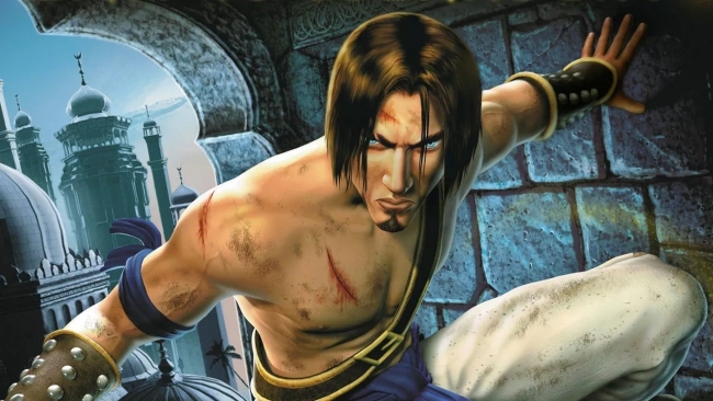
Prince of Persia: The Sands of Time Remake‘s reveal didn’t exactly go as Ubisoft had planned. For years, fans asked for a Prince of Persia game and many were happy to settle for a remake, but the reveal trailer unveiled a game with curious visuals, to say the least, with the general consensus that they looked dated and disappointing.
Ubisoft India – comprised of Pune and Mumbai studios – told The Mako Reactor during an interview that the remake’s visuals are a “stylistic choice” and not the result of budget or time constraints. The developers wanted to give the game a “unique” look to set it apart from other games.
Game Director Pierre Sylvain-Gires explained:
If you take the game that was made 17 years ago, there’s definitely room for improvement in terms of graphism and we really wanted to give a unique look to the game because Prince of Persia: The Sands of Time is actually is a fantasy story. The narration, the 40 different levels you have to go through to finish the game are an immersion into the Thief of Baghdad and all these magical environments. So we decided to go for a unique visual treatment to make this game standout from other games. It’s not another Assassin’s Creed, it’s not like the same Prince of Persia from 2008. It has to be unique. This magic, this fantasy is shown through the saturation, through the light, so it also a challenge to redefine the visual identity of the game with this remake.
What do our readers think?
[Source: The Mako Reactor]


