Finally, nearly everything we’ve been waiting to hear about the PS5 is starting to be revealed. Granted, with just four weeks to go until the console launch, that’s to be expected, but it’s nevertheless exciting to follow up the PS5 teardown video with an extensive PS5 UI reveal, even if it does let a few mysteries percolate. Similar to last week’s hardware teardown, I have watched and re-watched the PS5 UI reveal to get a good feel for everything revealed, and perhaps a few other things that might have gone under the radar.
Here’s the video again as a refresher:
PS5 UI Reveal Analysis
We start with an intro from Hideaki Nishino, head of PlayStation platform planning and management team. Nishino goes over the goals for the user experience, which centers around valuing play time, and keeping players in-game and engaged as much as possible. He also specifically says this is a look at “some of the features,” hinting that there’s more to show and come at a later date. It’s also a pre-production environment, which means there could be some minor changes on the retail release (as well as ongoing firmware updates that will add and change features over time).
Designed for 4K
You know when you walk into Costco or an electronics store and immediately see the TVs on display, massive 4K screens with high detail and bold and bright colors, full of tiny details? Multiple times during this presentation, it’s referred to as being “designed for 4K TVs,” and it shows. The dynamic range of colors, brightness and contrast, and tiny details are the type of thing that just beg to show off the power and beauty of a 4K display.
Over to you, Sid Shuman!
Nishino-san then hands the presentation over to PlayStation Communications’ Sid Shuman, a face and voice readers of the PlayStation Blog (and listeners of the PS Blogcast) should be very familiar with. It’s nice to see Sony communications leading up to the PS5 going back to these relatable voices again, something I recently talked about here on Daily Reaction. I can’t imagine Jim Ryan giving us a tour of the PS5 user experience.
The demo starts again on the same startup teaser we got back in the June PS5 reveal. This time, however, we’re treated to the user selection screen, something that’s caused quite a stir as a potential Killzone PS5 teaser (which personally, I think is a nothingburger. Speaking of burgers, have you won your PS5 through Burger King yet?). Shuman logs in, and is immediately greeted with the middle of a game of Sackboy: A Big Adventure from Rest Mode, which pulls up the PS5 Control Center.
Roger, Control Center
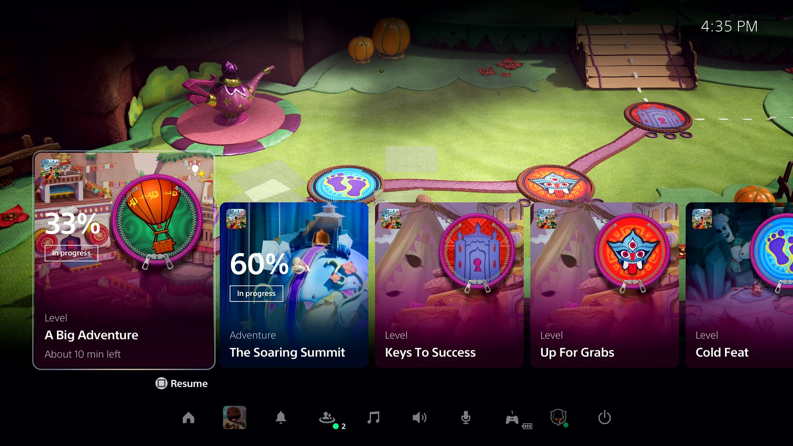
Before we get into the function of the Control Center and its Cards, I want to call out that this restore from Rest Mode is slightly different from the PS4, which just plops you right back into a game with no barriers. Now you have a menu of cards covering the bottom half of the screen, and you’ll need to hit the PS button to start playing your game. This would be like if the quick menu on the left side always came up first when you turned on your PS4. It’s not a huge deal, but I personally hope there’s an option for the default to just be starting into the game instead of needing to have the Cards pull up every single time I turn the console back on.
The Control Center functions much as the quick menu on PS4 does, except much, much more robust. It essentially pulls all the features of the main dashboard (and more) into an overlay so that you never have to leave your game to manage these options. Friends, messages, parties, etc. all of your basic console and account functions can be accessed from here.
All your Cards on the table
The Control Center isn’t where the real innovation lies, however. Cards present opportunities for both Sony and third-party developers to interconnect the games and the system in unique ways. It’s teased here that you can “follow” games in order to get developer and publisher updates on them through a set of “news” cards, so if you’re not 24/7 online like me, you can catch when new updates come out, DLC is added, or other news for games hits. This section of course relies on the developers and publishers staying on top of it, so it will be more robust for certain games than for others, I’m sure.
Sharing is once again center stage, with another card showing recent captures so you can quickly access, edit, and post them to a variety of places. No more needing to go to the capture gallery to hunt down the latest screengrabs and videos.
In regards to the playtime estimates for Activities, I want to know more about how this is calculated and just how accurate it will end up being. If it works reliably, this could be a great tool for getting in some quick gameplay before needing to rush off to some family event you don’t actually want to be at.
So much room for Activities
Within the Cards are contextual ones for the game you are playing, something Sony calls “Activities.” The key with Activities is that they can be used in a variety of ways by different developers, so we’ll see this feature being implemented uniquely. In this example, the Activity Cards represent Sackboy’s levels, and show you progress, goals, and estimated time remaining to completion. They also allow you to jump directly to that level without needing to deal with the game’s menus.
Shuman talks about how these Cards show both active Activities and ones that are suggested to the player by the PS5. The video also shows some locked Activities, indicating that there’s a smart system in place that won’t let you access ones that are unavailable to you in game.
Let your PS5 be your Guide
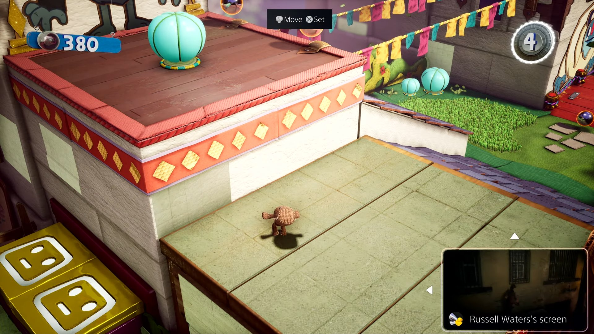
These Activity Cards also have the opportunity to offer hints via both text and video (a feature that is exclusive to PlayStation Plus). Importantly, this is all still an overlay, so you can either picture-in-picture the guide videos (with resize options and the ability to move it around) or setup a side-by-side option.
If there is one thing that worries me most about the Activity Cards and Game Help hints, it’s how much developers will actually support it. On the one hand, I’d love to be optimistic and think that developers will use these features in really cool, creative, and interesting ways that can really connect my gameplay with the overall console experience. On the other, I can see this being limited to Sony’s first-parties and a few resourceful third-parties, while the majority make bare bones use of the feature. I’d love to get a more in-depth dev talk on what it takes to design and implement these Cards for a game.
Community Party
The changes to the PS4 party chat system now make sense, seeing the PS5’s approach. Parties are now like community rooms, places where groups of friends can gather, play, share, and chat. It seems to take at least some minor cues from community platforms like Discord and Slack, implementing them in a console friendly way. Shuman calls them “Persistent spaces to connect with the groups that you play with.”
For the most part, this seems like the current party system with vastly improved and expanded functionality. Screen sharing in a party now pops up in a picture-in-picture window, so you can keep playing your game while your friend shares their own screen. Notably, here it shows Uncharted: Lost Legacy, hinting that backwards compatible games will take advantage of some of these features too.
Party Activities will also show up in the cards, as demonstrated by a Card for a Destruction All Stars multiplayer match. Again, this is similar to being able to join a player’s game from the party screen, just implemented in a much cleaner way to the Card menu. Here it should be noted that as Destruction All Stars starts up, there is no warning about Sackboy being closed, leading many to believe the PS5 will feature suspend and resume for multiple games, letting players jump right back into their other game where they left off.
As someone who plays online with groups of people, that would be a huge feature. If I’m playing a single-player game and want to play a few matches of Warzone or help my friends in a Destiny activity, I’d like to be able to quickly resume the single-player game when I am done.
Capture From the OS
Another expanded feature, the PS5 OS will feature more robust capture options at the system level. While they didn’t detail this feature too much, it’s a great solution for games that don’t have their own dedicated photo mode.
PS5 Dashboard
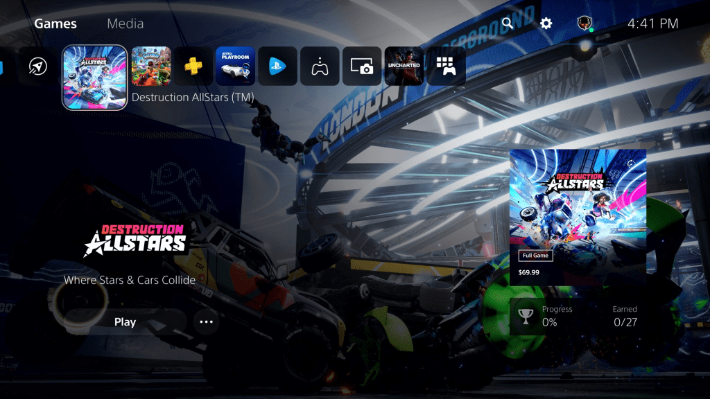
The dashboard is a great evolution, relatively simple and familiar design with a big display that will look great in 4K. The biggest change I noted here, aside from reorganizing the look of each game card, was moving media apps to a different section. Games will no longer be pushed down in the list because you wanted to watch The Boys on Amazon Prime.
The integrated hub puts the game cards right here on the dashboard, so you can jump right into games at these specific Activity checkpoints if you want to (and if the game supports it). Again, this whole game hub concept is one the PS4 had, but the PS5 just seems to do it better.
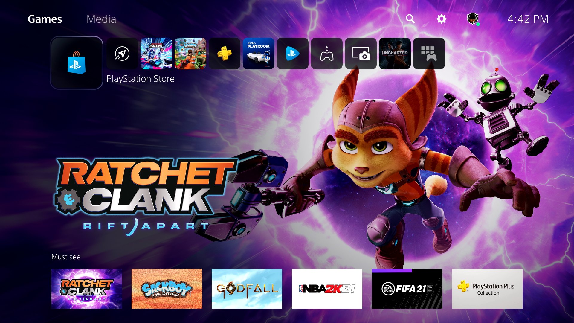
PlayStation Store integrated into the OS
The PS Store is now integrated right into the OS instead of loading up as an app once you click on it. The demo didn’t really browse it, so it’s hard to determine if this design is a good change or not, but if it’s faster to load, that’s a quick win right there. I’d like to see it toured more in the future though. Shuman does say it’s a “more personalized experience.”
Voice Dictation for Text
Finally. As long as I never have to swipe the touchpad or awkwardly move the lightbar around again. This section is also where Shuman talks about shared media having spoiler warnings based on where you are in a game, though again, this is up to the developer to implement.
Final Thoughts
Overall, I loved that this was a real-time demonstration. It showed how snappy and quick the UI is, and how all of these features work together in practice, not in a marketing sizzle video (go back and watch the PS4 UI reveal to see the difference there). However, much like a number of features I thought sounded really cool on PS4, it remains to be seen just how much I’ll actually use them in practice on the PS5.
In addition, while Sony’s created a robust feature-laden platform, many of these features rely on developers to utilize them. If there isn’t wide adoption, than many of these OS features could go entirely unused, or at least rather poorly implemented just to reach the lowest bar of quality. I’m optimistic that developers will see these as opportunities, but it’s a cautious optimism.
The PS5 UI strikes me as the actualization of everything Sony’s been trying to accomplish with the PS4, but didn’t quite have the hardware ability to do. It looks gorgeous, and the potential is vast, but only real world use will actually tell us which features will become second nature and which are new console gimmicks that won’t get used.
What do you think of the PS5 UI and user experience? Which features are you most excited for and which ones do you think you’ll never use? Let me know in the comments.
Daily Reaction reacts to the video game industry. Have suggestions for the column or subjects you’d like us to react to? Let me know in the comments below and be sure to check out previous Daily Reactions for more dives beyond the headlines.


