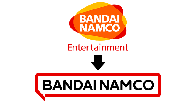
Bandai Namco Entertainment has officially changed its logo to a variation of the design that was revealed in October of last year. Like many companies have in the last few years, Bandai Namco decided to change its well-known and respected orange and red logo that has adorned its products (with variations) since the merger of Bandai and Namco in 2006 to a simplistic flat one that is immediately reminiscent of Nintendo.
Why did Bandai Namco change its logo?
Bandai Namco has released a lot of corpo speech as to why it changed its logo, but we don’t know the real reason. More than likely, someone got promoted to an executive position and decided to change it as a flex of their new power. Alternatively, some marketing firm could have weaseled in and convinced Bandai Namco execs to spend an exorbitant amount of money to replace the “outdated” logo.
Ironically, one of its greatest publishing successes, Elden Ring, was recently released using the old logo, and it’s immediately throwing away that newfound brand recognition.
Here’s what the official website has to say about the new design:
“The new logo’s speech bubble motif, “Fukidashi” in Japanese, expresses the potential of the brand to connect with people around the world and inspire them with amazing ideas. The speech bubble also represents Japan’s manga culture that has become so popular everywhere. The logo stands for our determination to communicate with fans worldwide, to connect with our fans, and to create entertainment unique to Bandai Namco.”
Opinion: Bandai Namco’s new logo is terrible
Jason writes: The Bandai Namco logo is devoid of character and bores me to tears. The team behind it (because a speech bubble with the company’s name in it required a team) inexplicably used red instead of the orange that made up the primary color of the previous logo. So, now, looking at the site presenting the logo just reminds me of Nintendo in style, color, and typography. It could have been worse, though. At least they didn’t stick with the magenta color that they originally introduced.


