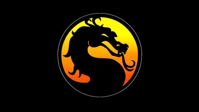
The iconic Mortal Kombat logo was almost scrapped because designer and co-creator John Tobias’ sister thought it was a seahorse rather than a dragon. This tidbit of information was revealed by Tobias himself in an interesting Twitter thread in which he delved into the logo’s history after discovering his very first drawing of it. The dragon was originally left-facing, with the developer later using both right-facing and left-facing dragons. But for trademark purposes, one had to be picked, so Tobias went with the logo we see today.
The story of Mortal Kombat logo
Here’s a recently discovered image of the very first drawing of #MortalKombat’s dragon icon. I designed the icon as both a symbol of our game and its fictional tournament… (thread) #MK30 pic.twitter.com/vVIDr4K9aP
— John Tobias (@therealsaibot) September 22, 2022
Tobias’ drawing above was digitized by Mortal Kombat artist John Vogel, and it was inspired by what could have been series’ title had Ed Boon and Tobias not changed it. That title? Dragon Attack.
The inspiration to use a dragon as the fictional tournament’s symbol came from “Dragon Attack,” which was in contention as our game’s title before @noobde and I changed it to “Mortal Kombat.” Here’s my rough marker sketch of the marquee logo… (3/9) pic.twitter.com/g3UY2X2boX
— John Tobias (@therealsaibot) September 22, 2022
Tobias didn’t say why the duo eventually chose Mortal Kombat, but he did reveal that Dragon Attack was inspired by Queen’s song of the same title, and Boon happens to love the band. In fact, the colors mentioned in the song’s lyrics were eventually used in Mortal Kombat’s arcade cabinet design by Tobias.
As far as the dragon itself is concerned, the inspiration came from a golden dragon statue that Vogel spotted on the desk of Midway’s general manager, Ken Fedesna. That statue still exists.
Bonus Kontent: @noobde recently snapped a photo of the actual dragon statue that we used… 30 years later! pic.twitter.com/scFTo4KAKZ
— John Tobias (@therealsaibot) September 22, 2022
The full thread is an interesting read especially if you’re a Mortal Kombat fan like me so make sure to check it out!


