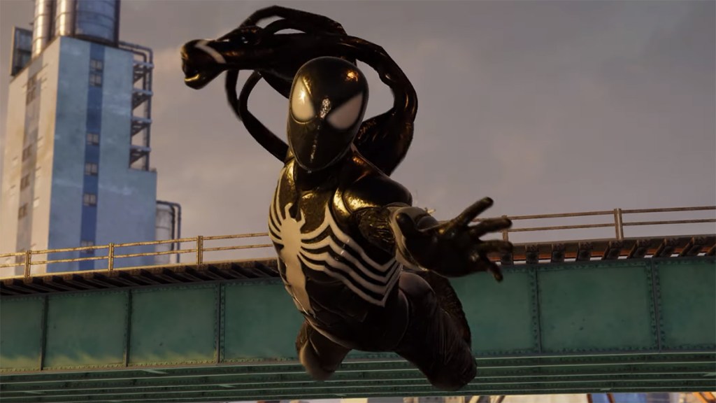
Marvel’s Spider-Man 2 is ditching the shackles of the PlayStation 4 and will therefore have the capability to be more visually impressive when it comes out exclusively on PS5. Some of this newfound power was evident in the PlayStation Showcase segment, but now a new comparison video featuring this non-final build has broken down a handful of those improvements seen in this sequel.
Spider-Man 2 features a denser version of New York
Digital Foundry’s Oliver Mackenzie picked apart the footage and compared it to 2018’s Spider-Man and Spider-Man: Miles Morales. In it, Mackenzie took note of specific parts of the city that are in all three titles. And in every scenario, Spider-Man 2’s version of the structure included more details, additional effects, or more varied textures. Some buildings have been switched out completely or are wholly new. For example, Spider-Man 2 adds the Harlem Seafood Market building near the sea, something that wasn’t even there in the prior titles.
Mackenzie also noted of the improved water. Water now deforms and sprays more realistically when characters splash in it. Mackenzie even said that ray tracing probably explains why the reflections in the water were better.
The version will likely have at least some changes before release, something Mackenzie pointed out. As such, more exact pixel counts, rendering resolutions, and more will have to wait until sometime in the fall. Regardless, Mackenzie said that the demo ran from 1296p to 1872p, which is a dynamic 4K setup that is in line with the Fidelity Mode of the other games. He concluded by saying that Spider-Man 2 was iterating on what came before, but that it “continues to look excellent” with the multiple upgrades seen in the demo.


