[Editor’s Note: The Domestic version of this game will allow players to change control schemes so that it is not touch-only. This review is of the Japanese version in its original form.]
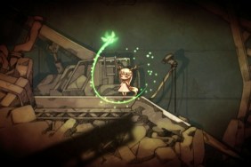
Having awakened within many a dark apocalypse myself, I felt drawn to Hotaru no Nikki: The Firefly Diary. In this game, a girl named Mion tries to find her way out of the darkness and into the light. You’ll guide her and help her regain some of her memory by directing a firefly with the Vita screen and back touch pad.
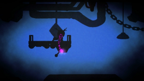
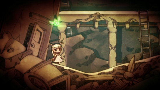
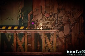
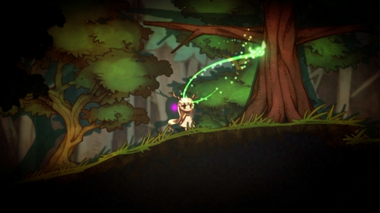
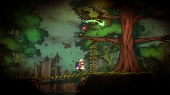
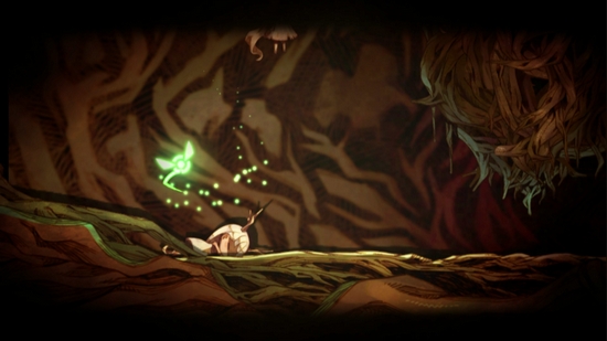
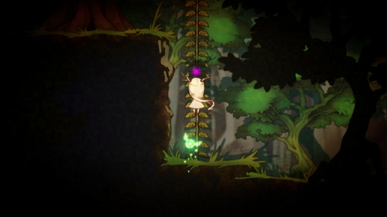
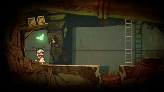
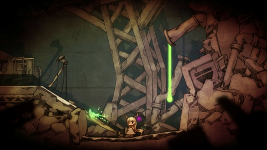
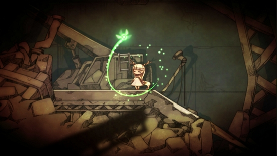
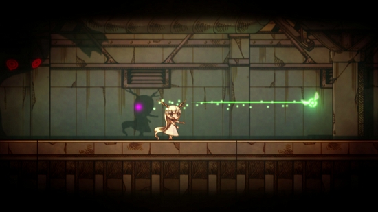
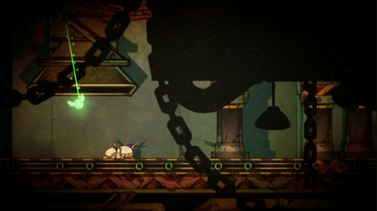
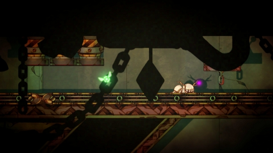
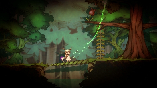
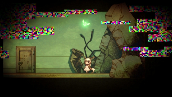
The Firefly Diary immediately sucked me in with its low-light atmosphere and aesthetics right out of a dark fairy tale. On Vita 1,000’s OLED screen, it looks gorgeous. The lighting is pretty, Mion is cute, and the sounds are nice enough. If music plays, it generally fits.
Hotaru no Nikki is entirely touch controlled. Buttons are of no use here — only the touchscreen and rear touch pad. The former is the main control, while the latter pauses time and moves the player’s attention to the shadows. One then takes control of another firefly to scour the area for objects to manipulate, thereby helping Mion on her way.
Help could come in many forms, such as knocking boxes into her path, allowing her to then push them and create stairs; breaking a pipe that would give her something to climb; smacking an angry monster in the head with some conveniently placed heavy objects, or any number of things.The challenge is to use both fireflies to figure out how to get Mion from Point A to Point B.
Naturally, some puzzles are head scratchers and others seem fairly obvious, but one near-constant problem is Mion’s slow movement. It feels way too slow and leads to frustration. You’ll see the next three moves in her step-by-step process, but have patience tested as she drifts about the screen.
This issue may have been alleviated if some button control had been available. Why not simply allow firefly control with one of the joysticks and switch from light to shadows with one of the many unused buttons? It wouldn’t have changed the gameplay except for making it tighter and easier to control. I found myself wanting button-based control early and often. (Note: the game is reportedly playable on Vita TV, but I played this game entirely on a regular Vita, as I do not have a Vita TV. If you do, then perhaps that might help. I can only speculate on that, however.)

But frustration with the design mounts as time goes on. After two or three areas, the game was a cute distraction, neither bad nor great, but it took a downhill dive.
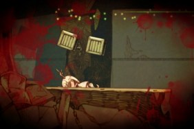
I love a good, deserved death. It motivates me to try a new strategy or improve my skills. But hotL#NiQ serves that special type of trial-and-error death that can’t possibly been predicted or prepared for. No skill can save you, only the experience of having died in that exact spot can. Expect to say things like, “Wait, that kills her?” and “Where the hell did that come from?” and other such phrases of dismay.
In a way, it hearkens back to the old arcade days when you had to memorize a game from beginning to end in order to beat it, and seeing a guy get to the end would mean he’d died thousands of times. And spent hundreds of dollars. Those games were designed as traps to get you pumping more coins into the machine; using the same devious design today feels cheap, because it is. Something being old does not make it fun.
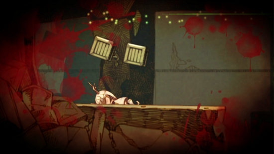
And then it all cycles back to slow movement and imprecise control. If you’re going to put players in situations such as the ones in Hotaru no Nikki, which can often require precise timing and tight movement, making the controls entirely touchscreen (and even worse, Vita’s back touch pad, ugh) is not the way to go. I’m not a fan of forced touchscreen use to begin with, but Uta Kumi 575 proved that a very good game can still come of it. But that game has responsive control, while Hotaru no Nikki does not.
You can’t design stages and situations that rely on precise timing and then give the game imprecise, unresponsive control. You can’t design a game in which memorization is key to survival and then throw in random elements that — by their nature– can’t be memorized, but can kill the player with absolutely no skill or reflex to possibly save them.
This may lie with the control not being to the girl directly, but to the firefly. The firefly is there to lead Mion around. Mion, however, is like a slower, dumber Princess Yorda.

At some points, you’re to navigate the firefly through a very narrow maze, touching the sides of which will kill you. Imagine how fun that was with the imprecise control and fact that my fingers aren’t transparent anymore.
Difficult gameplay segments can often lead to a feeling of satisfaction upon completion in other games, but not in hotL#NiQ. Instead, I felt relieved that I didn’t have to repeat the section again, nothing more. It felt like getting-out-of-prison good or my-shift-is-over good rather than winning-a-game good.
This finally changes, temporarily, in the final 20% or so of the game, when I was desperately asking “Where has this been?” Puzzles and atmosphere come to the forefront rather than randomized deaths.
Tales and Fales
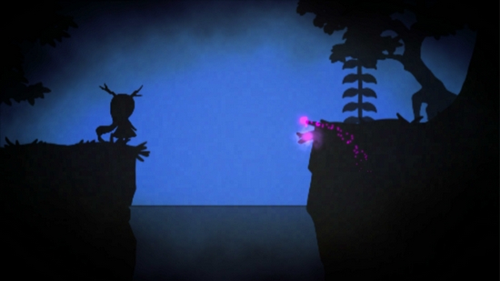
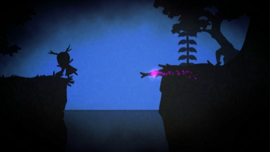
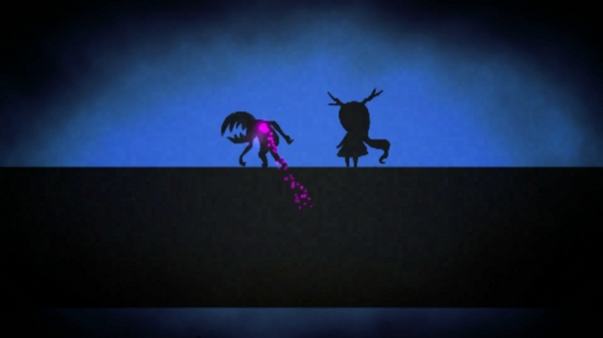
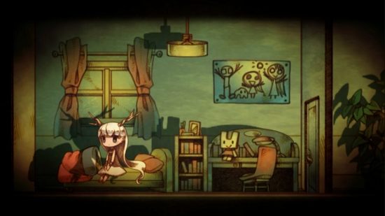
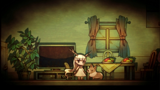
Hotaru no Nikki‘s story is told without words, but flashbacks. The segments are brief, but by finding memory fragments littered around the stages, you’ll see glimpses of Mion’s past, usually presented in a completely different aesthetic than the main game. They start out charming and progress to become quite dark. The shift is startling in a good way, leading up to a fantastic ending.
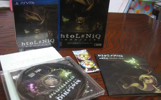
If you’re looking at the box and screens and thinking hotL#NiQ – Hotaru no Nikki: The Firefly Diary looks good, then maybe you can already tell you’ll like it. It’s audiovisually pleasing to be sure and has an interesting story. Because of that, some will surely turn a blind eye to all else in light of this. Gameplay, however, is broken and problematic. That said, I recommend it to budding game designers as an opportunity to look at what not to do when creating a game for a touchscreen or planning 2D puzzle platformer levels.
Game purchased by reviewer. You can read our Review Policy here.
(Post-review notes for importers. Read the PSLS guide to importing here.)
No Japanese knowledge is required to play this game. A few Start Menu options are present, which are written in Japanese, but they’d be very easy to figure out for people who can’t read it. The story is told without words. Despite some explanation being in written Japanese text, I think the visuals are straightforward enough that anyone would understand what they’re being told.
This game got physical and digital versions in Japan. Localizations for North America and Europe are happening near the end of February. Check your region’s specifications to see which versions are available.
The new version will allow a different control scheme using buttons and an analog stick.
-
Lovely world and atmosphere
-
Mion
-
Cute, yet gets surprisingly dark at times
-
Amazing ending
-
Trying something different
-
Touch only (in standard Vita version)
-
Imprecise, unresponsive, downright horrid controls
-
Not difficult, but that special "cheap" kind of faux-difficulty
-
Poorly designed stages
-
Slow movement and ridiculous deaths feel like artificially padding the length
Hotaru no Nikki - The Firefly Diary
-
HtoL#NiQ
-
HtoL#NiQ
-
HtoL#NiQ
-
HtoL#NiQ
-
HtoL#NiQ
-
HtoL#NiQ
-
HtoL#NiQ
-
HtoL#NiQ
-
HtoL#NiQ
-
HtoL#NiQ
-
HtoL#NiQ
-
HtoL#NiQ
-
HtoL#NiQ

-
HtoL#NiQ

-
HtoL#NiQ
-
HtoL#NiQ
-
HtoL#NiQ
-
HtoL#NiQ
-
HtoL#NiQ
-
HtoL#NiQ
